
Widgets collection
The Cockpit application includes pre-set widget types. Each widget type provides different parameters to configure and different data to be displayed.
Alarm list
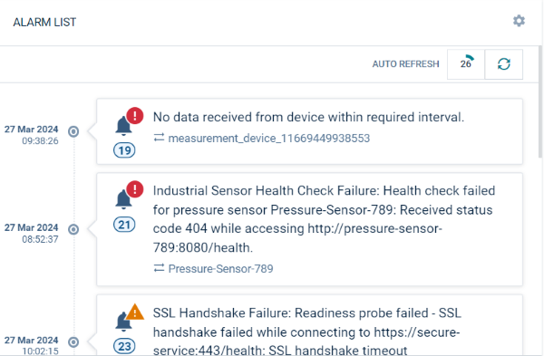
The “Alarm list” widget shows a list of alarms, filtered by objects, alarm severity and alarm status. For details on the information provided for each alarm, refer to Working with alarms.
Parameters to configure
| Field | Description |
|---|---|
| Title | Widget title. By default, the widget type is used as title. |
| Target assets or devices | Select groups or devices, optional HTML expressions which should be evaluated. |
| Status | Only show devices with alarms of of the selected alarm status. |
| Type | Only show alarms of the specified type(s). Details can be seen when clicking once on an alarm. |
| Severities | Only show alarms of the selected alarm severity. |
| Order | Alarms may be ordered by the active status (followed by severity and time, the default), by date (followed by time, either in descending or ascending order), or by severity (followed by time). |
| Auto refresh | Enables you to automatically refresh the alarm list at the frequency you select. |
| Show alarms from child devices | Show or hide the alarms of child devices. |
Asset notes
The “Asset notes” widget displays messages provided by the administrative user to all owners of the current widget.
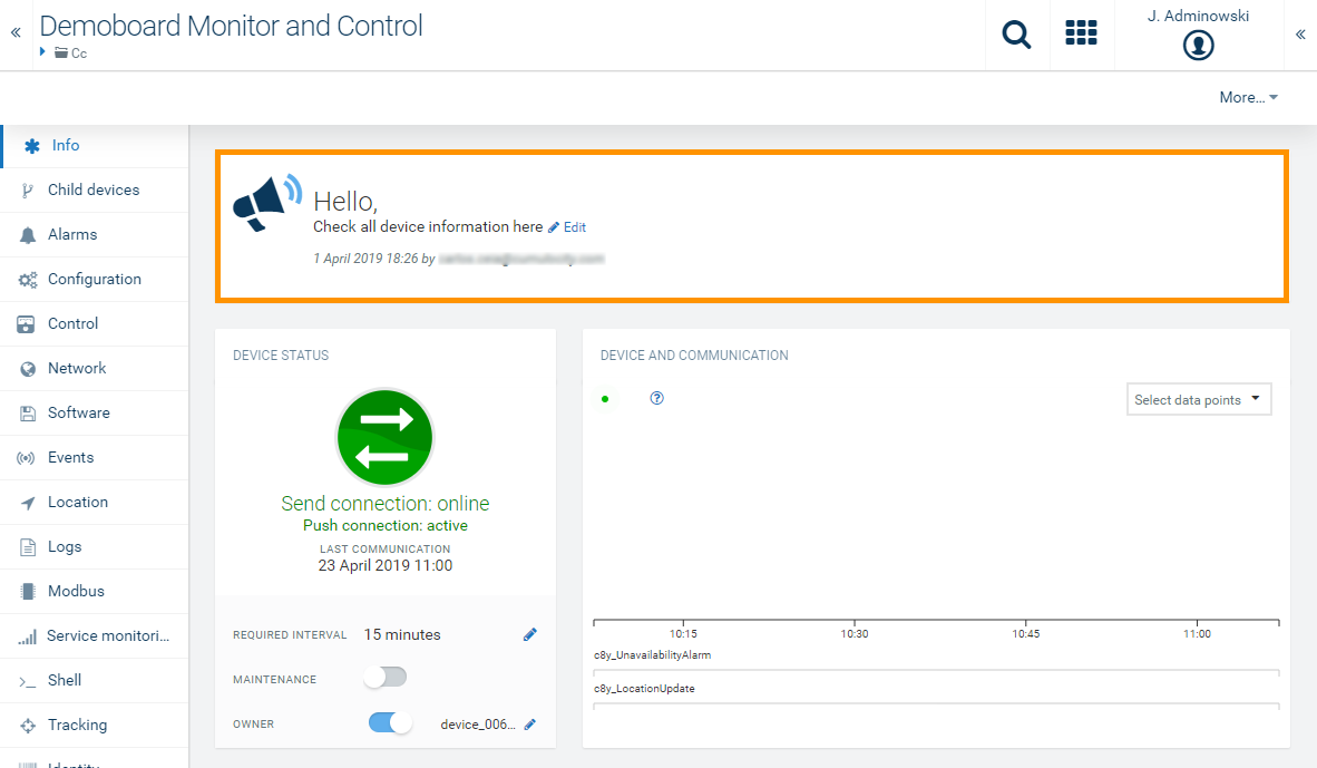
Only users with the permission to edit the home dashboard will be able to provide this message.
Asset properties
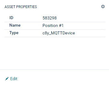
The “Asset properties” widget displays a user-defined list of attributes of the current object. The current object can be a device or a group.
Parameters to configure
| Field | Description |
|---|---|
| Title | Widget title. By default, the widget type is used as title. |
| Target assets or devices | Select groups or devices. |
| Properties | List of properties, see Asset table. |
Asset table
The “Asset table” widget shows details of a selected asset and all its child devices in a table. This is a very powerful widget, allowing you to arrange selected properties of objects in a table.
This feature is in Public Preview, that is, it is not enabled by default and may be subject to change in the future.
The new asset table widget provides enhanced customization and flexibility. You can configure columns, filter data, and view all descendants of the selected asset. The following settings are available:
Settings options
| Setting | Description |
|---|---|
| Include descendants | Show all descendant assets of the currently selected asset. (As a reference, the old widget was only displaying direct children of the selected asset.) |
| Show status icon column | Display a status icon column which matches the type of the asset. |
| Table header | Display the data grid header. |
| Active filters | Show applied filters in the header. |
| Configure columns | Enable column customization and show configuration button. |
| Striped rows | Alternate row background for readability. |
| Hover highlight | Change row background color on hover. |
| Loading indicator | Show a spinner while data loads. |
| Cell borders | Draw borders around table cells. |
| Icon with value | When cell rendering is set to icon, show both icon and value. |
| First column link | Render the first column (excluding computed and alarm types) as a link to asset details. |
Parameters to configure
| Field | Description |
|---|---|
| Title | Widget title. By default, the widget type is simply used as title. |
| Target assets or devices | Select for which object all child devices should be shown. This is typically a group object. |
| Properties | Select properties or actions of an object to visualize them as columns in the table. |
Example
In the following screenshot, five columns are configured. Three property columns “Name”, “Owner”, and “Type”, which refer to the properties “name”, “owner” and “type” respectively. Additionally, there are two actions, one for toggling the maintenance mode, and one for rebooting the device.
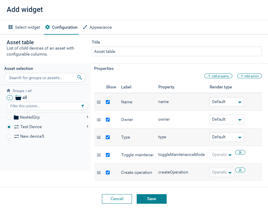
The resulting table is visualized as follows:

To add properties
Click +Add Properties and select one or more properties to be added.
To add actions
- Click +Add Action.
- Select Toggle maintenance mode to add the predefined action to toggle the maintenance mode.
- Select Create operation to create a button that will execute a shell command. In the resulting dialog box you can then enter the label for the button and the shell command to be executed.
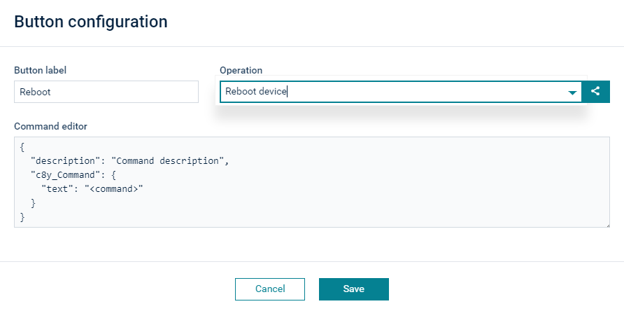
You can also enter the JSON format for the operation that will be sent to the device. For details, contact the device vendor for supported operations.
To modify the table
To edit the header of a column, click on its value in the Label column and edit the label.
You can rearrange the columns by clicking the icon at the very left of a row and dragging and dropping the entry.
To remove a property or an action, hover over the respective row and click Delete at the right.
Data graph
The “Data graph” widget shows a data point (measurement) in a graph. The visualization is the same as in the data explorer.
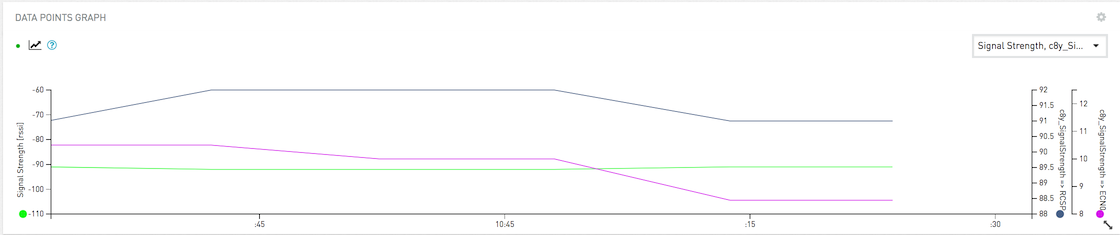
The easiest way to create a “Data graph” widget is to navigate to the data explorer, click the More… button in the top menu bar and select Send as widget to dashboard.
Refer to Changing visualization for further details on the parameters to be configured.
Data point list
The “Data point list” widget shows data points (measurements), one in each row, with current values and data point properties.
Parameters to configure
| Field | Description |
|---|---|
| Title | Widget title. By default, the widget type is simply used as title. |
| Data point | Shows a list of available data points. You must enable at least one data point. Click Add data point to add a data point to the list. For details on how to add data points see To add a data point. |
| Column visibility | Select which columns should be visible: Label: Label of the data point. See Changing visualization for details. Target: Target value. Can be configured in the data explorer or the data point library. Current: Current value. Diff: Absolute difference between current value and target value. Diff %: Percentage of difference between current value and target value. Asset: Name of the device or group of the data point. |
Data point table
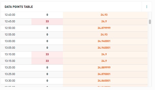
The “Data point table” widget configuration is similar to the “Data graph” widget, but instead of visualizing the data as a line-chart, data is visualized as a table.
The “Data point table” widget displays data based on selected data points, time interval and aggregation.
Out of range values, based on configured yellow and red ranges, are highlighted in the table.
Event list
The “Event list” widget lets you monitor events for a selected device.
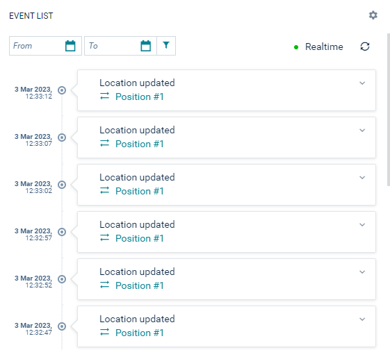
Additionally, a specific date range can be set and the events can be monitored in realtime.
Fieldbus device
The “Fieldbus device” widget lets you see the status of a modbus device and operate it.
For details on the “Fieldbus device” widget, refer to Monitoring the device status using the Fieldbus device widget.
Image
The “Image” widget lets you display a single image to be selected from your file system by browsing.
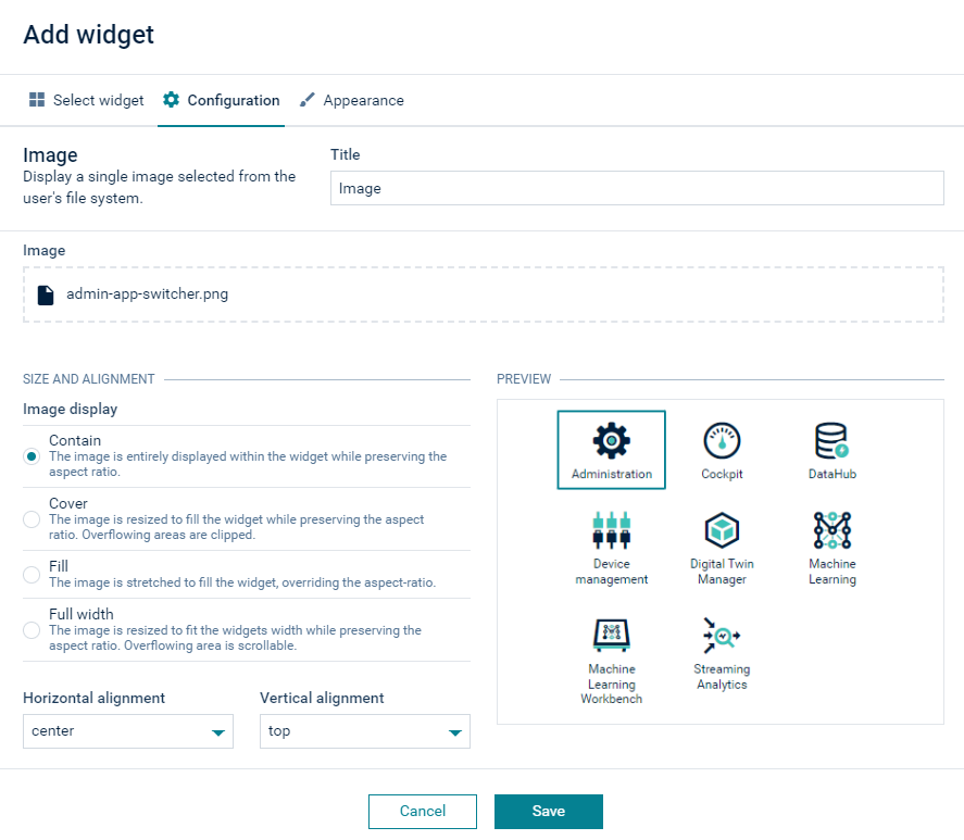
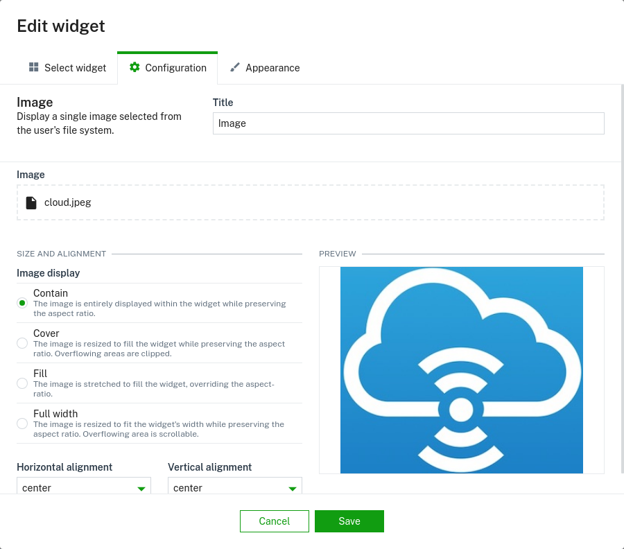
When the image is uploaded, it is possible to change the image size and alignment.
Info Gauge
The “Info gauge” widget visualizes one data point in form of a radial gauge and multiple data points as labels.
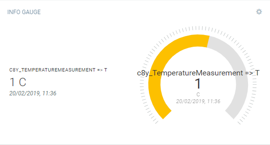
You can select one data point for the gauge, and multiple data points shown with labels at the left side.
You must enable at least one data point in each section to create the “Info gauge” widget.
HTML
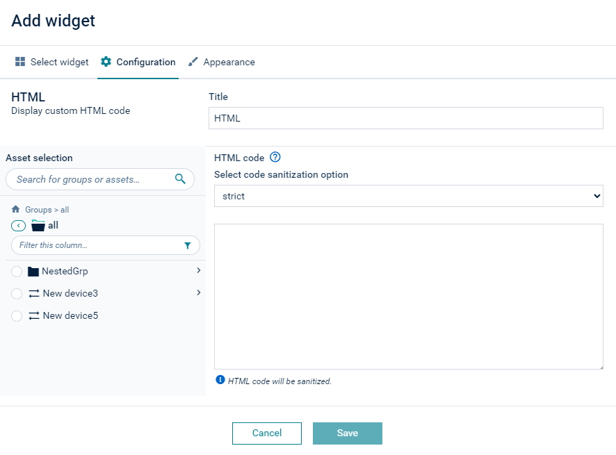
The “HTML” widget displays user-defined content that can be formatted using HTML and dynamically populated with data from the selected asset or device. Additionally, you can switch the widget into advanced mode, which allows you to build complex web components with JavaScript code.
Parameters to configure
- Asset selection: Optionally, select the asset whose managed object will be accessible via
c8yContextexpressions. - Asset properties: In the Asset properties section, you can add mappings to properties. Click Add mappings. Then select an asset and select properties from the Asset properties, Custom properties, and Computed properties tabs. Use the icon buttons to copy a code expression, clear a mapping, assign another property, or remove a mapping. At runtime, all mapped values are accessible in the HTML code under
c8yProperties, a plain object keyed by the mapping names. If you rename a mapping key, the references in the HTML code will be updated.
The widget offers two distinct modes:
-
Normal mode: You can apply HTML and CSS while adding properties as template literals. You can use simple expressions such as (always use optional chaining
?.because these objects may beundefinedwhile data is loading):${this.c8yContext ? this.c8yContext?.name : 'No device selected'}(wherec8yContextrefers to the widget’s selected asset)${this.c8yProperties?.<mappingName>}to access values of the mapped asset properties
-
Advanced mode: When enabled, you can build complex web components using the Lit framework. You can import supported ECMAScript modules. By default, leaflet, echarts, fetch, and lit are provided. Whatever is rendered in the web component will be displayed to the end user. Additional requests can be performed by importing the fetch library. The following shows the available imports:
import { LitElement, html, css } from 'lit';
import { styleImports } from 'styles';
import { L } from 'leaflet';
import * as echarts from 'echarts';
import { fetch } from 'fetch'; // Use this instead of default fetch to avoid potential issues
Inserting mapped properties into the code
When asset property mappings are configured, a dropdown button with a plus icon appears in the code editor toolbar. Select a key to insert the appropriate template expression (for example, ${this.c8yProperties?.temperature}) at the cursor position. Mapped keys also appear as autocomplete suggestions when typing this.c8yProperties?. or the name of a mapping.
Note: In case the referenced property is a complex object (for example, a full measurement object), you need to explicitly access a specific field (for example, ${this.c8yProperties?.temperature?.value} or ${this.c8yProperties?.temperature?.unit}) or use JSON.stringify(this.c8yProperties?.temperature) to display the whole object as a string.
Auto-refresh
The HTML widget is integrated with the dashboard’s global time context for auto-refresh control. On a dashboard, a link/unlink button is displayed in the widget’s title bar. When unlinked from the global time context, an auto-refresh toggle appears directly in the widget. Values in both c8yContext and c8yProperties are updated automatically when auto-refresh is enabled.
Translations
The HTML widget supports translations via c8yTranslate:
${this.c8yTranslate('Text to translate')}${this.c8yTranslate('text {{ var }}', { var: value })}
Note: Texts must be written in English and their translations must be available in the standard application translations, or in the custom ones provided via the localization feature, or in the application options.
Styling and security considerations
When using styles, global styles can be applied if encapsulation is not enabled. Styles should always use CSS variables and tokens to ensure compatibility with dark mode and custom brandings.
By default, the normal HTML widget is sanitized for security, while in advanced mode the developer is responsible for proper sanitization. You can modify the default sanitization behavior in the Cockpit application configuration.
A simple example looks like this:
Legacy widget compatibility
To migrate a legacy widget
Migrating a legacy widget to the new format requires familiarity with JavaScript and HTML. The migration process involves replacing all AngularJS-specific code.
Depending on the complexity of your original widget, there are two migration approaches:
- Simple mode: Replace placeholders and template syntax. Use this mode if your widget does not contain custom JavaScript logic in a
<script>tag. - Advanced mode: Build complex web components with custom JavaScript. Use this mode if your widget contains custom JavaScript logic or event handlers.
Step 1: Assess your widget
Check your current widget code. If it contains specific JavaScript logic in a <script> tag, you need to use advanced mode. If not, use simple mode.
Step 2: Migrate placeholders in simple mode
The following example shows legacy widget code:
<p ng-if="device.name === 'Alpine Hiker #1'">
  Hello {{device.name}}.
</p>
Migrated to the template syntax, this is:
${ this.c8yContext.name === 'Alpine Hiker #1' ? html`<p>Hello ${this.c8yContext.name}</p>` : '' }
Step 3: View the generated code
Create a new widget with your migrated code. HTML widgets that are migrated use an AngularJS legacy mode which you can view by opening the “advanced mode” to inspect the generated code:
import { angular } from 'angular';

// NOTE: This is a legacy template for the HTML widget.
// It is used to compile the HTML content in the context of the AngularJS application.
// The template is injected into the AngularJS application and compiled using the AngularJS compiler.
// The template should only be used for backward compatibility purposes.
// It is recommended to use a web component instead.

if (!angular) {
  throw new Error('AngularJS is not available. Please make sure to include AngularJS in your project.');
}

const $injector = angular.element(document.querySelector('c8y-ui-root')).injector();
if (!$injector) {
  throw new Error('AngularJS injector is not available. Maybe not an hybrid application?');
}

// defining a new scope
const $rootScope = $injector.get('$rootScope');
const $scope = $rootScope.$new(true);

// faking the old angularjs config
$scope.child = {
  config: {
    device: { id: "2698590822", name: "Alpine Hiker #1" },
    html: `<div ng-controller="HtmlWidgetCtrl"><p ng-if="device.name === 'Alpine Hiker #1'">
  Hello {{device.name}}.
</p>
</div>`
  }
};

// load the needed services
const $compile = $injector.get('$compile');
const $controller = $injector.get('$controller');

// create the element
const htmlElement = angular.element($scope.child.config.html);

// The default controller providing the context
$controller('HtmlWidgetCtrl', { $scope });

// Compile the element
$compile(htmlElement)($scope);

// Apply the scope changes
$rootScope.$apply();

export default htmlElement[0];
The generated legacy mode code enables backward compatibility.
Step 4: Use advanced mode for web components
To use the new web component-based approach, copy your code to a new widget and enable the advanced mode. The following shows how the Lit-based HTML layout works:
import { LitElement, html, css } from 'lit';
import { styleImports } from 'styles';

export default class DefaultWebComponent extends LitElement {
  static styles = css`

:host > div {
  padding: var(--c8y-root-component-padding-default);
}
span.branded {
  color: var(--brand-primary, var(--c8y-brand-primary));
}
  `;

  static properties = {
    // The managed object this widget is assigned to. Can be null.
    c8yContext: { type: Object },
  };

  constructor() {
    super();
  }

  render() {
    return html`
      <style>
        ${styleImports}
      </style>
      ${this.c8yContext.name === 'Alpine Hiker #1' ? html`<p>Hello ${this.c8yContext.device}</p>` : ''}
    `;
  }
}
This example demonstrates the basic structure of a Lit web component.
Step 5: Add interactivity in advanced mode
In advanced mode, you add elements like event handlers. This allows you to migrate more complex legacy widgets with custom <script> tags. The following example is shortened to show only the important parts:
//[…]

  static properties = {
    c8yContext: { type: Object },
    helloText: { type: String } // add this to ensure "rerendering" on changes
  };

  //[…]

  sayHello() {
   this.helloText = 'Hello world';
  }

  render() {
    return html`
      <style>
        ${styleImports}
      </style>
      ${this.c8yContext.name === 'Alpine Hiker #1' ? html`<p @click="${this.sayHello}">
         Hello ${this.c8yContext.device}</p>
      ` : ''}

      ${this.helloText}
    `;
  }
//[…]
This example shows how to handle click events and update the component state.
Step 6: Verify the migration
After migration, test the widget to ensure:
- All data displays correctly.
- Interactive elements work as expected.
- The widget responds to the device or asset selection.
By leveraging the Lit web components framework, you migrate nearly every custom AngularJS or JavaScript implementation in a legacy widget. To request additional data, import the fetch library to directly request data from the platform.
KPI
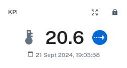
The “KPI” (Key Performance Indicators) widget visualizes a data point as a label, for example, a data point for the temperature of a device.
Parameters to configure
On the left side, select the data point you want to display. You must select only one active data point to create the “KPI” widget. If you select multiple data points at once, you cannot save the configuration.
On the right side, you can adjust how the data point is going to be displayed. This includes:
- Icon: The icon to be displayed next to the data point
- Number of decimal places
- Display: Allows to toggle whether the timestamp, icon and trend indicator should be displayed
- Font size of measurement value
Linear Gauge
The “Linear gauge” widget visualizes data points in form of a linear gauge. Min and max target values are shown on the gauge as well.
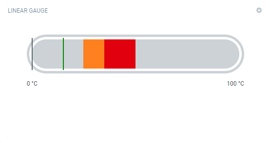
You must enable at least one data point to create the “Linear gauge” widget.
Map
The “Map” widget shows the location of a device or all devices of a group.
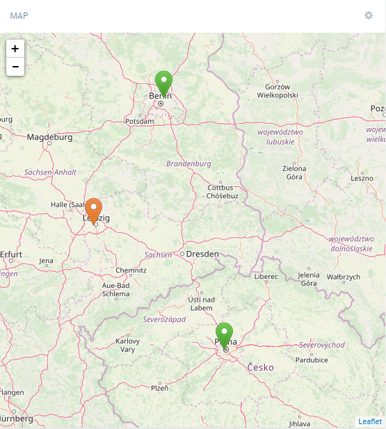
You can drag the map and move its content, and you can zoom in and out by using the Plus and Minus buttons.
The icons representing the devices are color-coded. The color used follows these rules:
- Red = At least one CRITICAL alarm
- Orange = At least one MAJOR alarm
- Yellow = At least one MINOR alarm
- Blue = At least one WARNING
- Grey = No alarm
Click a device icon, to open a popup with the following information:
- The device name. When clicked, the application navigates to the device.
- The date at which the device last reported its location, if available.
Parameters to configure
- Target assets or devices: Select which devices are shown on the map. If a group is selected, all devices in that group, including those in subgroups, are visible.
- Marker icon: Icon of the marker on the map.
- Zoom level: Default zoom level of the map.
- Center bound: The default map coordinates.
- Refresh interval: The refresh interval for the selected device or asset. If only one device is selected, instead of refresh interval, realtime option can be selected together with “follow selected” device toggle which would follow the device after location update.
Markdown
The “Markdown” widget can be used to display markdown content. Using the “Markdown” widget you can inform users, for example, on new features.
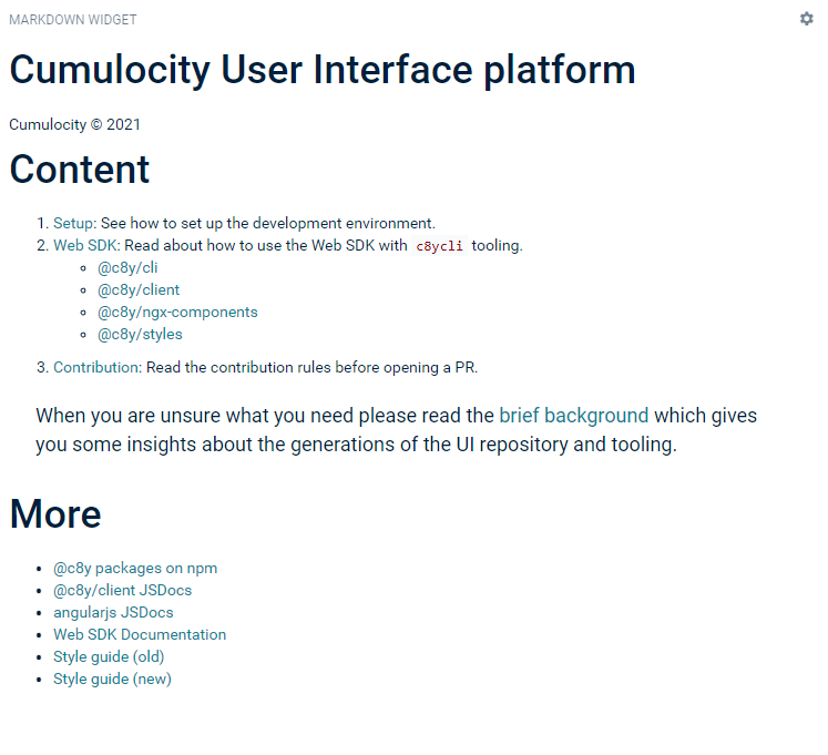
There are several ways to provide markdown content:
- Upload a markdown file.
- Provide a URL to an external source.
- Add “/README.md” as a relative file path in order to provide the README file of the current application as source.
Message sending
The “Message sending” widget sends a message to a device. The behavior of the device itself is device-dependent. Only available for devices that support the operation c8y_Message.
Pie chart
The “Pie chart” widget displays data points (measurements) with current values in a pie chart presentation.
Parameters to configure
| Field | Description |
|---|---|
| Title | Widget title. By default, the widget type is simply used as title. |
| Pie chart options | Select from the options to show tooltips, percentages, legends in the pie chart. |
| Data point | Shows a list of available data points. You must enable at least one data point. Click Add data point to add a data point to the list. For details on how to add data points see To add a data point. |
Quick links
The “Quick links” widget displays links in either a grid or list format.
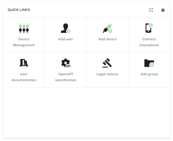
You can add, edit, or remove links to customize the widget according to your needs.
Radial Gauge
The “Radial gauge” widget visualizes data points in the form of a radial gauge, making it ideal for monitoring values like temperature, pressure, or performance metrics at a glance.
Presets and customization
You can choose from various preset styles such as “Default”, “Pointer”, “Progress bar”, “Progress indicator”, and “Grade rating”. Each preset provides a distinct visual design.
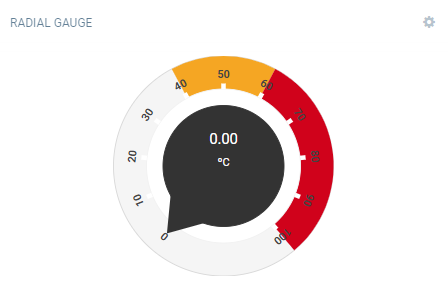
You must enable at least one data point to create the “Radial gauge” widget.
For full control, click Show advanced options to customize the gauge’s appearance and behavior.
Advanced options reference
| Category | Property | Description |
|---|---|---|
| General | name |
Name of the gauge preset |
radius |
Radius of the gauge (for example, “90%”) | |
center |
Center position of the gauge (for example, ["50%", "50%"]) |
|
startAngle, endAngle |
Start and end angles of the gauge arc | |
| Split lines | splitNumber |
Number of segments in the gauge |
splitLineLength, splitLineLengthRatio |
Length of split lines (absolute or ratio) | |
splitLineDistance, splitLineDistanceRatio |
Distance of split lines from axis (absolute or ratio) | |
splitLineColor, splitLineWidth |
Color and width of split lines | |
| Ticks | tickShow |
Whether to show ticks |
tickWidth, tickColor |
Width and color of ticks | |
tickDistance, tickDistanceRatio |
Distance of ticks from center (absolute or ratio) | |
tickLength, tickLengthRatio |
Length of ticks (absolute or ratio) | |
| Axis | axisLabelDistance, axisLabelDistanceRatio |
Distance of axis labels from center |
axisLabelColor |
Color of axis labels | |
axisLabelFontSize, axisLabelFontSizeRatio |
Font size of labels (absolute or ratio) | |
axisLabelFontSizeMin, axisLabelFontSizeMax |
Minimum and maximum font size for labels | |
axisLineWidth, axisLineWidthRatio |
Width of the axis line (absolute or ratio) | |
| Pointer | showPointer |
Whether to show the pointer |
pointerStyle, pointerColor |
Style and color of the pointer | |
pointerWidth, pointerWidthRatio |
Width of pointer (absolute or ratio) | |
pointerLength, pointerLenghtRatio |
Length of pointer (absolute or ratio) | |
pointerOffset |
Offset of pointer from center | |
| Progress bar | progressBar |
Enable progress bar |
progressBarWidth |
Width of the progress bar | |
progressBarRoundCap |
Rounded caps on progress bar ends | |
progressBarColor |
Color of the progress bar | |
additionalGaugeColors |
Extra colors for segmented gauge bars | |
| Typography | measurementValueFontRatio |
Font size ratio of the measurement value |
measurementValueFontMin, measurementValueFontMax |
Min and max font size for measurement value | |
measurementValueColor |
Color of the measurement value text | |
unitFontSize, unitFontRatio |
Font size or ratio of the unit label | |
unitFontMin, unitFontMax |
Min and max font size for the unit label | |
unitColor |
Color of the unit label | |
dateFontSize, dateFontRatio |
Font size or ratio of the timestamp | |
dateFontMin, dateFontMax |
Min and max font size for the timestamp | |
dateColor |
Color of the timestamp | |
| Details | showDetail |
Show detailed information like value or markers |
valueFontSize |
Font size for the displayed value | |
detailOffsetCenter |
Offset of detail from center | |
showMarkPoint |
Show mark points on the gauge |
Relay array control
The “Relay array control” widget lets you switch relays on or off independently in an array of relays. Only available for devices that support this type of operation.
Relay control
The “Relay control” widget allows you to switch a device relay on or off. Only available for devices that support this type of operation.
Rotation
The “Rotation” widget lets you render an object model of a device.
Parameters to configure
| Field | Description |
|---|---|
| Title | Widget title. By default, the widget type is simply used as title. |
| Target assets or devices | Select group or device to be displayed. |
| Object model for rendering | Select an object model type for rendering. May be one of “Box model” or “Phone model”. |
| Wireframe | Turn “Wireframe” on or off (default = on). The “wireframe” mode displays the object in a skeletal representation. |
| Camera type | Select the type of camera to be used. May be one of “Orthographic camera” or “Perspective camera”. |
In the “Rotation” widget you can rotate the object by dragging and moving it around. Zoom in and out by using the mouse.
SCADA
The “SCADA” widget displays a dynamic SVG image representing an asset or device status. It is ideal for building custom dashboards simulating SCADA panels, showing live states, measurement values, and alarms.
Setting up the “SCADA” widget
To configure the “SCADA” widget, follow these steps:
-
Go to a dashboard, switch to edit mode, and click Add widget in the top menu.
-
Select the “SCADA” widget and provide a title.
-
Optionally, select the asset or device in the Asset selection section (its child assets or devices can be selected in the mappings, too).
-
In the SVG configuration section, select the SVG source:
- Upload file — browse or drop an SVG file.
- Paste text — paste SVG code directly into the editor.
- Generate with AI — the AI agent analyzes the selected asset’s properties, measurements, alarms, and events. Use the built-in suggestions to get started quickly: Analyze and suggest proposes up to 3 distinct visualization options to explore, while Best guess automatically selects the most useful single visualization. You can also type a custom prompt — effective prompts typically describe the type of system or device (for example, “water pump”, “cooling unit”, “temperature monitoring panel”), the key values to display (for example, “show temperature, pressure, and flow rate”), and any visual preferences such as color-coded alarm indicators. The agent can look up available measurements automatically, so you do not need to know the exact fragment or series names.
If you upload or paste your own SVG files, you can enhance them with Lit syntax for dynamic content — see Preparing SVG files for the “SCADA” widget for details.
-
Optionally, configure Display settings — see Display options below.
-
Add placeholders: If the imported SVG file does not have the desired placeholders yet, in the preview area, click
textortspanelements to convert them into dynamic placeholders. -
For each placeholder, assign an asset/device property in Placeholder mappings — these properties (like ID, name, status, temperature) will be displayed dynamically in the SVG.
-
Optionally, use the Advanced editor for complex visualizations using Lit syntax and direct web component editing.
-
After confirming all settings, preview the widget and click Save to add it to your dashboard.
Preparing SVG files for the “SCADA” widget
This section applies when you edit SVG code in the built-in editor or when you prepare an SVG in an external tool. If you prefer an external tool, https://boxy-svg.com/ is an easy-to-use Chrome extension well suited for this purpose.
The “SCADA” widget uses Lit syntax (${...}) for dynamic content, conditions, and interactivity. All argument values passed to utility functions (such as deviceId, groupId, alarmsStatus) are typically taken from this.c8yScadaValues (which means they will appear in the placeholder mappings section and should be mapped to corresponding asset/device properties).
How it works:
- Asset or device property values are accessible via
${this.c8yScadaValues?.placeholderName || '-'}:- use
?because the values object may be undefined when the widget is loading, - use
|| '-'to provide a default value if the placeholder is not assigned or no value is available.
- use
- Additional utility functions are available via
${this.c8yScadaFunctions?.functionName(...)}:goToDeviceDetails(deviceId)– navigates to the device details,goToGroupDetails(groupId)– navigates to the group details,getActiveAlarmsStatusClass(alarmsStatus)– takes the alarm status object and returns a CSS class that can be used for styling:none,warning,minor,major,critical.
- JavaScript expressions and template literals within SVG attributes and content are supported.
Example SVG template with Lit syntax:
<?xml version="1.0" encoding="utf-8"?>
<svg width="600px" height="300px" viewBox="0 0 600 300" xmlns="http://www.w3.org/2000/svg">
  <style>
    .critical { fill: red; }
    .ok { fill: green; }
  </style>

  <text x="50" y="50" font-size="24" font-weight="bold">
    Device: ${this.c8yScadaValues?.deviceName || '-'}
  </text>

  <text x="50" y="100" font-size="20">
    Battery: ${this.c8yScadaValues?.batteryValue || 0} %
  </text>

  <circle cx="320" cy="95" r="15"
    class="${(this.c8yScadaValues?.batteryValue < 20) ? 'critical' : 'ok'}" />

  <text x="50" y="150" font-size="20">
    Status: ${this.c8yScadaValues?.status || 'Unknown'}
  </text>

  <g class="button" @click=${() => this.c8yScadaFunctions?.goToDeviceDetails(this.c8yScadaValues?.deviceId)}>
    <rect x="50" y="200" width="150" height="35" fill="blue" />
    <text x="125" y="225" font-size="16" fill="#FFF" text-anchor="middle">Go to device details</text>
  </g>
</svg>
Key points:
- Use
${this.c8yScadaValues?.property}for asset data (such as device name, battery, status). - Use utility functions like
${this.c8yScadaFunctions?.goToDeviceDetails(...)}for interactivity. - You can apply conditional classes, calculations, and custom JavaScript inside
${...}.
Display options
The Display settings section controls how the SVG is fitted inside the widget:
- Full-width — the SVG stretches to fill the widget width (default).
- Contain — the SVG fits within the widget boundaries while preserving its aspect ratio. When this option is selected, additional alignment controls become available:
- Horizontal alignment — left, center, or right.
- Vertical alignment — top, center, or bottom.
Migration from the legacy “SCADA” widget
Old “SCADA” widgets relying on AngularJS syntax continue to work as before — they are automatically detected and run in compatibility mode, labelled Legacy in the widget configuration. Legacy widgets can still be viewed and edited within their original configuration.
To use the new web component capabilities, the SVG must be migrated to Lit syntax. You can either adapt the existing SVG following the conversion table below and upload or paste it, or paste the existing SVG directly into the AI generation chat and ask it to convert it to the new Lit-based syntax.
| AngularJS syntax | Lit syntax |
|---|---|
{{propertyName}} |
${this.c8yScadaValues?.propertyName || '-'} |
ng-class="expression" |
class="${expression}" |
ng-if="condition" |
${condition ? '...' : ''} |
ng-show="condition" |
style="${condition ? '' : 'display:none'}" |
ng-style="{ color: val }" |
style="color: ${this.c8yScadaValues?.val}" |
ng-click="goToDeviceDetails(deviceId)" |
@click=${() => this.c8yScadaFunctions?.goToDeviceDetails(deviceId)} |
ng-repeat="item in list" |
${list.map(item => `...`).join('')} |
Example migration:
AngularJS:
<!-- placeholders: {{alarmsStatus}}, {{batteryValue}}, {{deviceId}} -->
<tspan ng-class="getActiveAlarmsStatusClass(alarmsStatus)">
  {{batteryValue}}
</tspan>
<rect ng-click="goToDeviceDetails(deviceId)"/>
Lit:
<tspan class="${this.c8yScadaFunctions?.getActiveAlarmsStatusClass(this.c8yScadaValues?.alarmsStatus)}">
  ${this.c8yScadaValues?.batteryValue || '-'}
</tspan>
<rect @click=${() => this.c8yScadaFunctions?.goToDeviceDetails(this.c8yScadaValues?.deviceId)} />
Legacy “SCADA” widget
The “SCADA” widget provides a graphic representation of the status of a device.
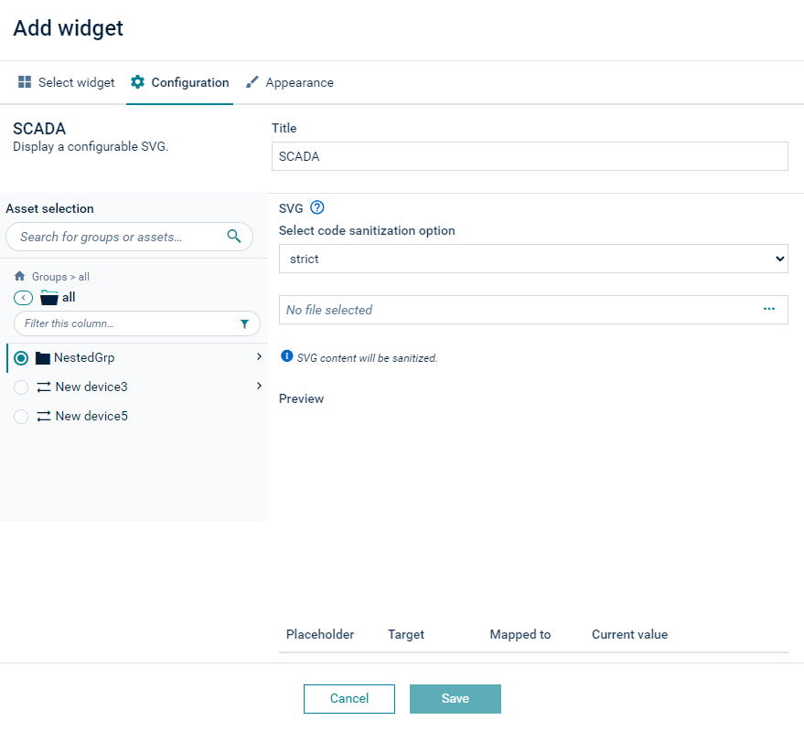
To use the “SCADA” widget, follow these steps:
- Select a dashboard and click Add widget in the top menu bar.
- Select the “SCADA” widget and edit the title of the widget.
- Select the device that should be shown in the widget in the Asset selection section.
- Upload an SVG file with the graphic representation of the device. SVG files are vector graphics that must be specifically prepared with placeholders for the status information. See Preparing SVG files for the legacy “SCADA” widget below.
- Assign placeholders to devices. Note that multiple devices can be taken as source.
- You now must assign each placeholder to a property of the device. Hover over each placeholder and select Assign device property or Assign fieldbus property. In the upcoming dialog box, basic device properties or fieldbus properties (that is, status coils and registers) can be selected. Select the desired property and click Select.
- After assigning all placeholders, a preview of the widget with the current values of the properties is shown. Click Save to place the widget on the dashboard.
The following code sanitization options can be selected:
- strict - Does not allow any JS or AngularJS directives.
- lax (default) - Allows partly JS (events) and all AngularJS directives.
- none - Allows everything.
Preparing SVG files for the legacy “SCADA” widget
The “SCADA” widget accepts SVG files that use AngularJS directives, for example, ng-if, ng-show, ng-style, ng-repeat, ng-click, for dynamic data presentation.
Moreover, JavaScript event attributes (like onclick, onmouseover) can be used in SVG files uploaded to “SCADA” widgets.
Data from devices (like latest measurements and other properties) are provided via placeholders. There are also predefined helper functions which can be used.
For creating SVG files, it is recommended to use https://boxy-svg.com/. It is an easy-to-use, quality Chrome extension.
Placeholders
For a placeholder to be recognized by the “SCADA” widget, it must occur at least once in double curly braces with no other expression, for example {{placeholderName}} (in a comment, attribute’s value, or element’s content - see example). Once annotated, the placeholder can be used within other expressions, for example {{placeholderName * 3.1415}}, ng-class="{ active: placeholderName > 100 }" or ng-if="placeholderName === 'VALUE'".
Predefined functions
The following predefined functions are available for use in expressions:
goToGroupDetails(groupId)– takes the group ID and redirects the user to the group details view, for example,<... ng-click="goToGroupDetails(groupId)">,goToDeviceDetails(deviceId)– takes the device ID and redirects the user to the device details view, for example,<... ng-click="goToDeviceDetails(deviceId)">,getActiveAlarmsStatusClass(alarmsStatus)– takes the alarm status object and returns a CSS class that can be used for styling:none,warning,minor,major,critical, for example,<... ng-class="getActiveAlarmsStatusClass(alarmsStatus)">.
Example
<?xml version="1.0" encoding="utf-8"?>
<svg width="600px" height="600px" viewBox="0 0 600 600" xmlns="http://www.w3.org/2000/svg">
  <!-- Annotate placeholders in comments: -->
  <!-- {{batteryValue}} -->
  <!-- {{alarmsStatus}} -->

  <style>
    .critical {
      fill: red;
    }
  </style>

  <!-- or in an attribute: -->
  <text data-placeholder="{{batteryValue}}"
    class="text"
    x="50"
    y="200"
    width="200">
    <!-- pass placeholder's value to a predefined function to get alarms status CSS class: -->
    <tspan ng-class="getActiveAlarmsStatusClass(alarmsStatus)" style="font-size: 45pt;">
      <!-- or in an element's content: -->
      {{batteryValue}}

      <!-- a placeholder can be also a part of expression, for example,: -->
      {{batteryValue * 100}} %
    </tspan>
  </text>
</svg>
Silo
The “Silo” widget displays data points (measurements) with current values in a silo presentation.
Parameters to configure
| Field | Description |
|---|---|
| Title | Widget title. By default, the widget type is simply used as title. |
| Data point | Shows a list of available data points. You must enable at least one data point. Click Add data point to add a data point to the list. For details on how to add data points see To add a data point. |
Traffic light
The “Traffic light” widget visualizes the states of a device as traffic light.
Parameters to configure
| Field | Description |
|---|---|
| Title | Widget title. By default, the widget type is simply used as title. |
| Target assets or devices | Select group or device to be displayed. |
| States mapping | Select a property for each light. The value of the property must be one of the following to have the respective light on: true, 1, any non-empty string, any non-null number. |