Widgets collection
The Cockpit application includes preset widget types. Each widget type provides different parameters to configure and different data to be displayed.
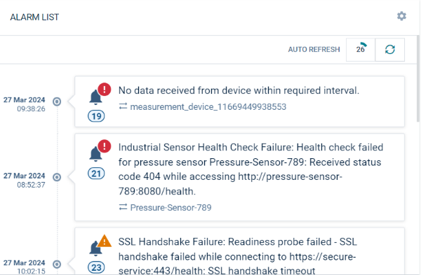
Alarm list
The “Alarm list” widget shows a list of alarms, filtered by objects, alarm severity and alarm status. For details on the information provided for each alarm, refer to Working with alarms.
Parameters to configure
| Field | Description |
|---|---|
| Title | Widget title. By default, the widget type is used as title. |
| Target assets or devices | Select groups or devices, optional HTML expressions which should be evaluated. |
| Status | Only show devices with alarms of of the selected alarm status. |
| Type | Only show alarms of the specified type(s). Details can be seen when clicking once on an alarm. |
| Severities | Only show alarms of the selected alarm severity. |
| Order | Alarms may be ordered by the active status (followed by severity and time, the default) or the severity (followed by time). |
All critical alarms
The “All critical alarms” widget shows all objects with a critical alarm. Apart from the title, there are no additional parameters to be configured.

For details on alarms, refer to Working with alarms.
Applications
The “Applications” widget shows a list of links to all available applications. Apart from the title, there are no additional parameters to be configured.
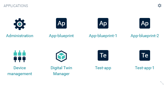
For details on applications, refer to Managing applications.
Asset notes
The “Asset notes” widget displays messages provided by the administrative user to all owners of the current widget.
Only users with the permission to edit the home dashboard will be able to provide this message.
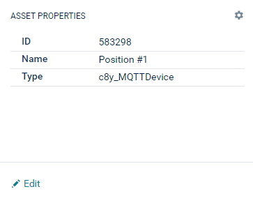
Asset properties
The “Asset properties” widget displays a user-defined list of attributes of the current object. The current object can be a device or a group.
Parameters to configure
| Field | Description |
|---|---|
| Title | Widget title. By default, the widget type is used as title. |
| Target assets or devices | Select groups or devices. |
| Properties | List of properties, see Asset table. |
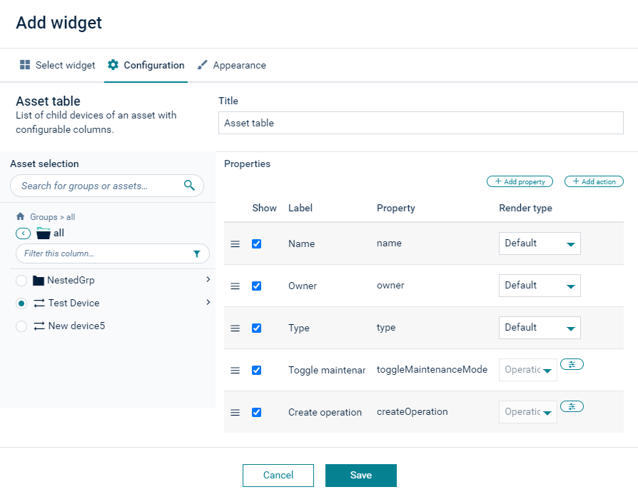
Asset table
The “Asset table” widget shows details of a selected asset and all its child devices in a table. This is a very powerful widget, allowing to arrange selected properties of objects in a table.
Parameters to configure
| Field | Description |
|---|---|
| Title | Widget title. By default, the widget type is simply used as title. |
| Target assets or devices | Select for which object all child devices should be shown. This is typically a group object. |
| Properties | Select properties or actions of an object to visualize them as columns in the table. |
Example
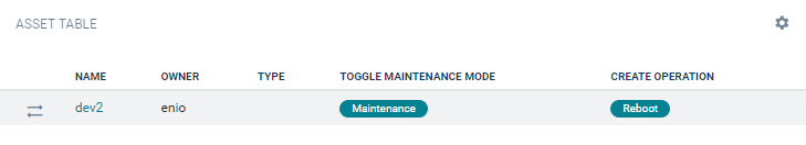
In the following screenshot, five columns are configured. Three property columns “Name”, “Owner”, and “Type”, which refer to the properties “name”, “owner” and “type” respectively. Additionally, there are two actions, one for toggling the maintenance mode, and one for rebooting the device.
The resulting table is visualized as follows:
To add properties
Click +Add Properties and select one or more properties to be added.
To add actions
- Click +Add Action.
- Select Toggle maintenance mode to add the predefined action to toggle the maintenance mode.
- Select Create operation to create a button that will execute a shell command. In the resulting dialog box you can then enter the label for the button and the shell command to be executed.
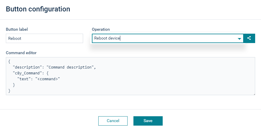
You can also enter the JSON format for the operation that will be sent to the device. For details, contact the device vendor for supported operations.
To modify the table
To edit the header of a column, click on its value in the Label column and edit the label.
You can rearrange the columns by clicking the icon at the very left of a row and dragging and dropping the entry.
To remove a property or an action, hover over the respective row and click Delete at the right.
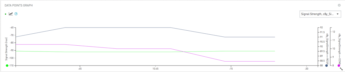
Data point graph
The “Data point graph” widget shows a data point (measurement) in a graph. The visualization is the same as in the data explorer.
The easiest way to create a “Data point graph” widget is to navigate to the data explorer, click the More… button in the top menu bar and select Send as widget to dashboard.
Refer to Changing visualization for further details on the parameters to be configured.
Data point list
The “Data point list” widget shows data points (measurements), one in each row, with current values and data point properties.
Parameters to configure
| Field | Description |
|---|---|
| Title | Widget title. By default, the widget type is simply used as title. |
| Data point | Shows a list of available data points. You must enable at least one data point. Click Add data point to add a data point to the list. For details on how to add data points see To add a data point. |
| Column visibility | Select which columns should be visible: Label: Label of the data point. See Changing visualization for details. Target: Target value. Can be configured in the data explorer or the data point library. Current: Current value. Diff: Absolute difference between current value and target value. Diff %: Percentage of difference between current value and target value. Asset: Name of the device or group of the data point. |
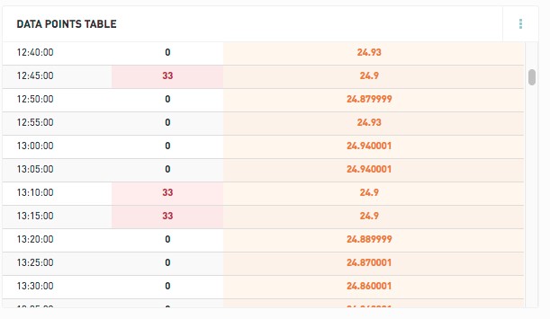
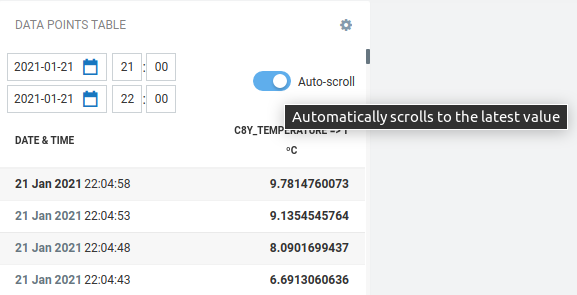
Data point table
The “Data point table” widget configuration is similar to the “Data point graph” widget, but instead of visualizing the data as a line-chart, data is visualized as a table.
The “Data point table” widget displays data based on selected data points, time interval and aggregation.
Out of range values, based on configured yellow and red ranges, are highlighted in the table.
At the top right of the data point list, an Auto scroll toggle determines the display behavior:
- Auto-scroll on - When a new measurement arrives, the widget automatically scrolls to the top so that you can see the latest value.
- Auto-scroll off - When a new measurement arrives, the display does not change and the table still shows the same snippet of data.
Event list
The “Event list” widget lets you monitor events for a selected device.
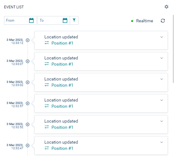
Additionally, a specific date range can be set and the events can be monitored in realtime.
Fieldbus device
The “Fieldbus device” widget lets you see the status of a modbus device and operate it.
For details on the “Fieldbus device” widget, refer to Monitoring the device status using the Fieldbus device widget.
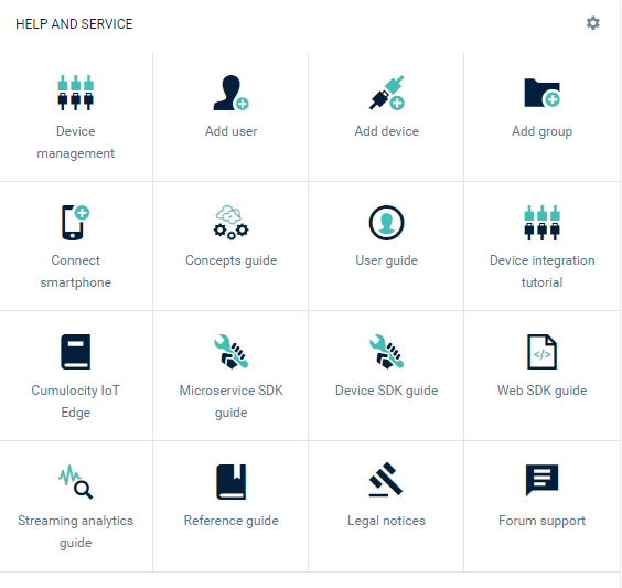
Help and service
The “Help and service” widget displays links to help and service resources. There are no additional parameters to be configured.
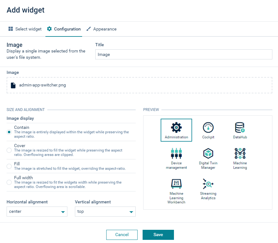
Image
The “Image” widget lets you display a single image to be selected from your file system by browsing. When the image is uploaded, it is possible to change the image size and alignment.
Info Gauge
The “Info gauge” widget visualizes one data point in form of a radial gauge and multiple data points as labels.
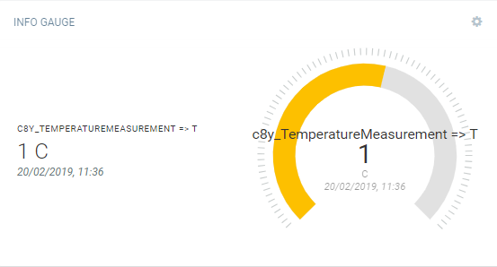
You can select one data point for the gauge, and multiple data points shown with labels at the left side.
You must enable at least one data point in each section to create the “Info gauge” widget.
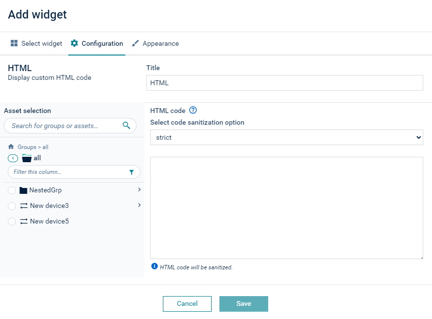
HTML
The “HTML” widget shows user-defined content. The content can be formatted using HTML.
Parameters to configure
-
Target assets or devices: Select the objects for which optional HTML expressions are evaluated.
-
HTML code
The following variables can be used inside the HTML content:
-
{{devicesCount}}: Total number of devices.
-
{{usersCount}}: Total number of users.
-
{{deviceGroupsCount}}: Total number of groups.
-
{{device.name}}: The name of the device.
-
{{device.property}}: More general form of the above. You can address any property of the device.
-
{{device.c8y_Hardware.model}}: The model of the device.
-
{{device.fragment.property}}: More general form of the above. You can address any property of any fragment of the device.
-
{{devices[deviceId].name}}: The name of the device at the specified index.
-
{{devices[deviceId].property}}: More general form of the above. You can address any property of the device at the specified index.
-
“Device” refers to the target device, as selected in the widget configuration parameter.
“fragment.property” refers to the properties of the respective device. To see the available property names, you can use the “Asset property” or “Asset table” widget and click +Add property in the widget configuration. This will show a table of supported properties. You can copy and paste the values from the column Property. Generated properties of these widgets are not available in the HTML widgets.
The following code sanitization options can be selected:
- strict - Does not allow any JS or angularjs directives.
- lax (default) - Allows partly JS (events) and all angularjs directives.
- none - Allows everything.
If you want to use a link in the HTML code field, for example a link to a dashboard, you must use the following format:
<a style="cursor:pointer;" onclick="location.hash = '#/group/<<group-id>>/dashboard/<<dashboard-id>>'">link to another dashboard</a><br />
KPI
The “KPI” (Key Performance Indicators) widget visualizes a data point as a label, for example, a data point for the temperature of a device.
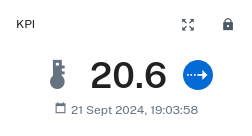
Parameters to configure
On the left side, select the data point you want to display. You must select only one active datapoint to create the “KPI” widget. If you select multiple data points at once, you cannot save the configuration.
On the right side, you can adjust how the data point is going to be displayed. This includes:
- Icon: The icon to be displayed next to the data point
- Number of decimal places
- Display: Allows to toggle whether the timestamp, icon and trend indicator should be displayed
- Font size of measurement value
Linear Gauge
The “Linear gauge” widget visualizes data points in form of a linear gauge. Min and max target values are shown on the gauge as well.
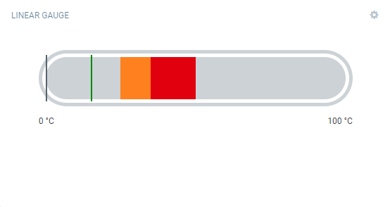
You must enable at least one data point to create the “Linear gauge” widget.
Map
The “Map” widget shows the location of a device or all devices of a group.
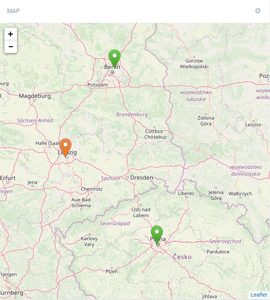
You can drag the map and move its content, and you can zoom in and out by using the Plus and Minus buttons.
The icons representing the devices are color-coded. The color used follows these rules:
- Red = At least one CRITICAL alarm
- Orange = At least one MAJOR alarm
- Yellow = At least one MINOR alarm
- Blue = At least one WARNING
- Green = No alarm
Click a device icon, to open a popup with the following information:
- The device name. When clicked, the application navigates to the device.
- The date at which the device last reported its location, if available.
Parameters to configure
- Target assets or devices: Select which devices are shown on the map. If a group is selected, all devices in that group (but not in any subgroups) are visible.
- Marker icon: Icon of the marker on the map.
- Zoom level: Default zoom level of the map.
- Center bound: The default map coordinates.
- Refresh interval: The refresh interval for the selected device or asset. If only one device is selected, instead of refresh interval, realtime option can be selected together with “follow selected” device toggle which would follow the device after location update.
Markdown
The “Markdown” widget can be used to display markdown content. Using the “Markdown” widget you can inform users, for example, on new features.
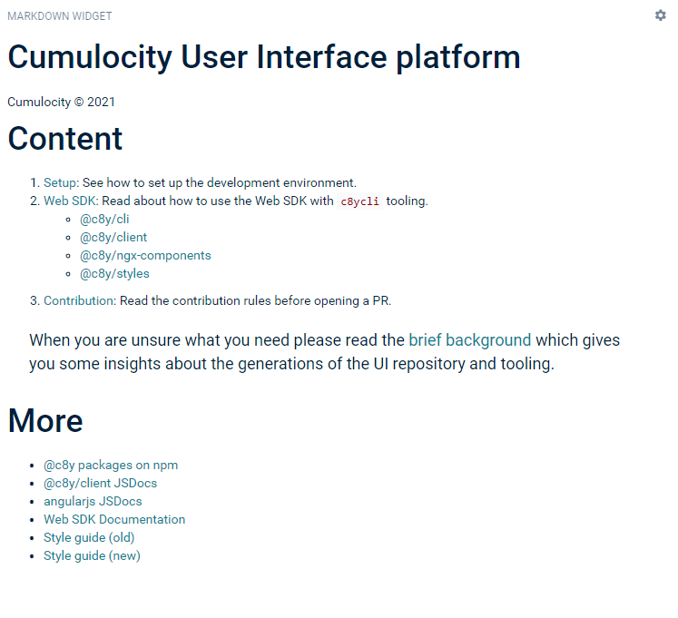
There are several ways to provide markdown content:
- Upload a markdown file.
- Provide a URL to an external source.
- Add “/README.md” as a relative file path in order to provide the README file of the current application as source.
Message sending
The “Message sending” widget sends a message to a device. The behavior of the device itself is device-dependent. Only available for devices that support the operation c8y_Message.
Pie chart
The “Pie chart” widget displays data points (measurements) with current values in a pie chart presentation.
Parameters to configure
| Field | Description |
|---|---|
| Title | Widget title. By default, the widget type is simply used as title. |
| Pie chart options | Select from the options to show tooltips, percentages, legends in the pie chart. |
| Data point | Shows a list of available data points. You must enable at least one data point. Click Add data point to add a data point to the list. For details on how to add data points see To add a data point. |
Radial Gauge
The “Radial gauge” widget visualizes data points in form of a radial gauge.
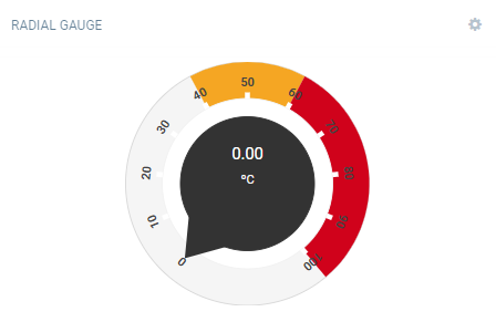
You must enable at least one data point to create the “Radial gauge” widget.
Recent alarms
The “Recent alarms” widget shows all alarms of all severity sorted by time. There are no additional parameters to be configured.

For details on alarms, refer to Working with alarms.
Relay array control
The “Relay array control” widget lets you switch relays on or off independently in an array of relays. Only available for devices that support this type of operation.
Relay control
The “Relay control” widget allows you to switch a device relay on or off. Only available for devices that support this type of operation.
Rotation
The “Rotation” widget lets you render an object model of a device.
Parameters to configure
| Field | Description |
|---|---|
| Title | Widget title. By default, the widget type is simply used as title. |
| Target assets or devices | Select group or device to be displayed. |
| Object model for rendering | Select an object model type for rendering. May be one of “Box model” or “Phone model”. |
| Wireframe | Turn “Wireframe” on or off (default = on). The “wireframe” mode displays the object in a skeletal representation. |
| Camera type | Select the type of camera to be used. May be one of “Orthographic camera” or “Perspective camera”. |
In the “Rotation” widget you can rotate the object by dragging and moving it around. Zoom in and out by using the mouse.
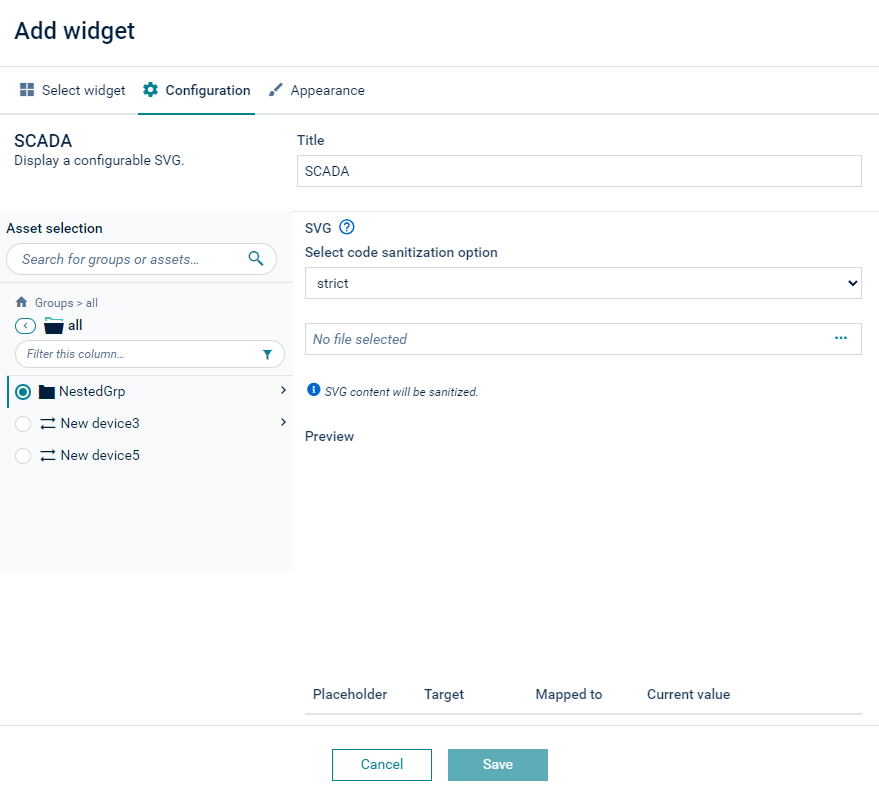
SCADA
The “SCADA” widget provides a graphic representation of the status of a device.
For details on the “SCADA” widget, refer to Monitoring the device status using the SCADA widget.
The following code sanitization options can be selected:
- strict - Does not allow any JS or angularjs directives.
- lax (default) - Allows partly JS (events) and all angularjs directives.
- none - Allows everything.
Silo
The “Silo” widget displays data points (measurements) with current values in a silo presentation.
Parameters to configure
| Field | Description |
|---|---|
| Title | Widget title. By default, the widget type is simply used as title. |
| Data point | Shows a list of available data points. You must enable at least one data point. Click Add data point to add a data point to the list. For details on how to add data points see To add a data point. |
Traffic light
The “Traffic light” widget visualizes the states of a device as traffic light.
Parameters to configure
| Field | Description |
|---|---|
| Title | Widget title. By default, the widget type is simply used as title. |
| Target assets or devices | Select group or device to be displayed. |
| States mapping | Select a property for each light. The value of the property must be one of the following to have the respective light on: true, 1, any non-empty string, any non-null number. |