UI functionalities and features
Main screen elements
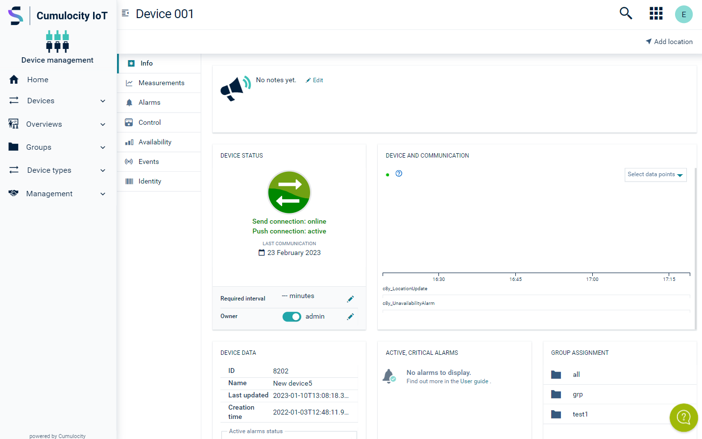
The general structure common to all Cumulocity applications includes the following screen elements:

| Element | Description |
|---|---|
| Navigator | On the left you find the navigator. At the top of the navigator the name and logo of the application is displayed, indicating which application you are currently using. Below you find a list of entries leading to the various pages of the application. The entries are grouped into menus and menu items. You can collapse or expand menus in the navigator by clicking the menu name. Clicking the small arrow at the very left of the top bar will hide/or unhide the navigator. Per default, it is visible. |
| Page | "Page" actually refer to the main area in the application. The content provided here depends on the menu item selected in the dashboard. The structuring of the content differs from page to page. Data can for example be displayed in a list with a row for each object or you can find it being presented in a grid in which objects are represented by cards. |
| Tabs | Some pages, for example the page of any particular device, are divided into several tabs, either displayed vertically or horizontally. |
| Top bar | Page title At the left of the top bar the title of the active page is displayed, if any. Search button Clicking the Search button opens a search field to enter text for a full-text search. For details, see Search and filter functionality. Not always available. Application Switcher button Clicking the Application Switcher button opens the application switcher which allows you to quickly switch between applications. Right from the Application Switcher button you will find the User button with your username. Clicking it will open up a context menu with commands related to your account settings. Other buttons/ information may be available in the top bar depending on the application and the page being displayed. |
| Top menu bar | Depending on the active application and the active page, a secondary bar is displayed below the top bar providing further functionalities like a Reload link for reloading the page or a Realtime link for the display of real-time data. A help icon indicates that inline contextual help content is available for the page. Clicking it opens a drawer with a short introduction on the page’s functionality and a direct link to the specific section in the user documentation for more details. Note that the help content is only available in English. |
| Right drawer | Clicking the user icon at the very right of the top bar will unhide/hide the right drawer, offering access to the user settings, quick links to other applications and to relevant documentation. Per default, the right drawer is hidden. |
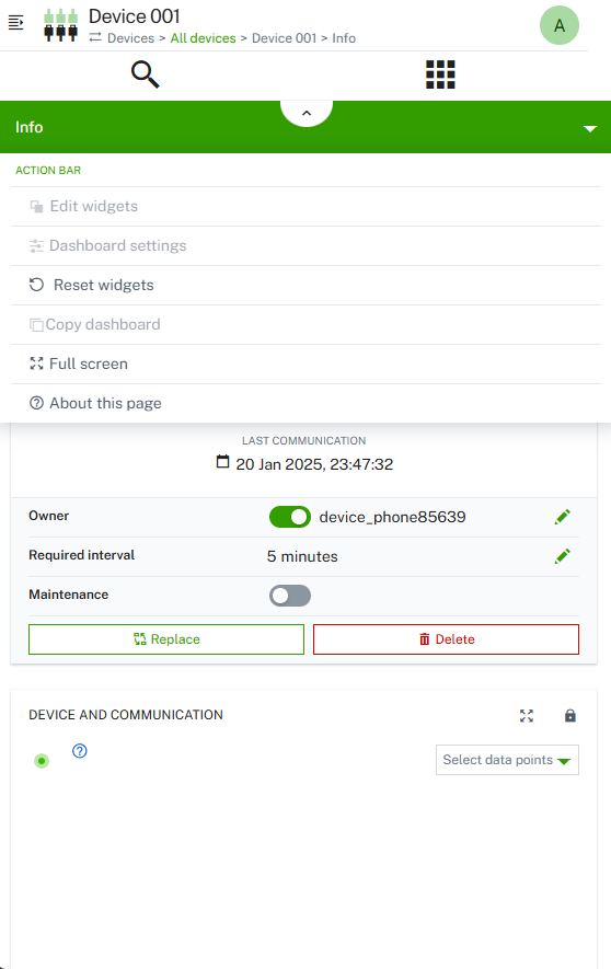
On smaller screens, the layout is slightly different. The navigator is hidden and can be accessed by clicking the arrow icon on the top left. Only the active tab is displayed. To switch tabs, click the arrow on the tab header and select a tab from the list.

Application switcher
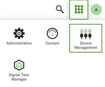
The application switcher allows you to quickly switch between applications. Click the Application Switcher button at the right of the top bar to display a list of icons representing applications.

The application switcher shows all Cumulocity applications you currently have access to. These can be subscribed applications or custom applications. Just click the icon for the desired application to open it as active application.
Search and filter functionality
Full text search
Cumulocity provides a full text search, available through the Search button at the right of the top bar in the UI.
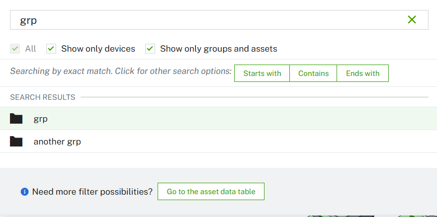
On entering a search term into the textbox at the top of the Search window, Cumulocity returns all assets (groups, devices, child devices) matching the search criteria.

Under Search results, the assets matching the search criteria are shown. To see more details click Go to the assets table at the bottom right. This will show the entire search results in a table format.
The Search window only lists a limited number of matches. In case of more matches, to see the complete results you must switch to the asset table.
Exact match
By default, the search option Exact match is applied.
The underlying search functionality is based on the MongoDB full text search. For details, see https://docs.mongodb.com/manual/text-search/.
Entering multiple words separated by a blank returns all objects that match any of the words. For example, entering
My Demo Device
will return objects containing “My”, “Demo” or “Device”.
If you want to search for objects matching an exact phrase enclose it in quotation marks:
"My Demo Device"
You can also exclude words by putting a hyphen before the word to search the inventory for objects containing, for example, “My” or “Demo” but not “Device”:
My Demo -Device
Case is ignored. The following search texts return the same result:
My Demo Device
my demo device
Alternative search options
Other than with filtering, using wildcards in a search is not supported.
Instead, you can switch the search option by clicking one of the following buttons:
- Starts with,
- Contains or
- Ends with.
This will search for assets starting with, containing or ending with the search term, respectively.
Filtering
Some pages offer a filtering functionality to filter objects in a list.

As opposed to the search functionality, on entering filter criteria you must not necessarily enter complete words.
In many cases you can just enter any arbitrary text into the text field, even just 2-3 characters. Entering
cl
will reduce the list to all objects containing the string “cl”.
In other cases you may enter * as wildcard character to return all objects starting with “cl”:
cl*
The list will immediately be reduced to the selected objects.
On certain pages, the filter mechanism only searches through items shown on a page. This means that if an item is not listed on the respective page, it will not appear in the results. You must load all results first to search through all items. This behavior applies to the following pages:
- Device protocols
- Firmware repository
- Software repository
- Configuration repository
- Tenants
- File repository
For details on the filtering mechanism in the devices list refer to To filter devices.
Real-time behavior of the navigator
In the navigator, changes are not updated in real time, meaning new, removed or renamed devices or groups will not be updated immediately.
You will only see such changes in the navigator of the application, in which you have made the changes.
Example
If you unassign a device from a group in the Device management application it is immediately removed from the group in the navigator of your current application. However, if you have another window open with another Device management application, you won’t see the changes, but will only see the changes after a refresh or another request (expanding a group in the navigator for example).
